Background
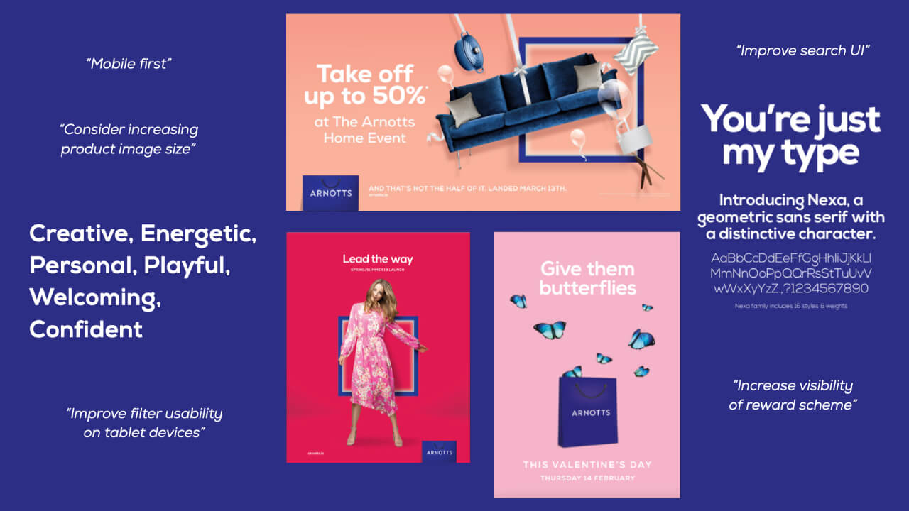
In 2018, Arnotts began a process of reevaluating their brand identity. An external design agency was brought in to develop a clear, ownable and exciting brand world for Arnotts creating a clear direction for all brand activity.
Deliverables included:
- New logo
- New Shopping bag
- New Brand colours, typography & unified visual direction
- Customer Personas
- Tone of Voice
The Challenge
Our task was to translate the brand work, which had a heavy lean to more traditional advertising, and incorporate this into the Arnotts digital products. The project had a number of deliverables phased over a 6 month period and we would work with a design agency to assist in delivering across the projects.

- Arnotts Checkout Redesign (Aug 2019)
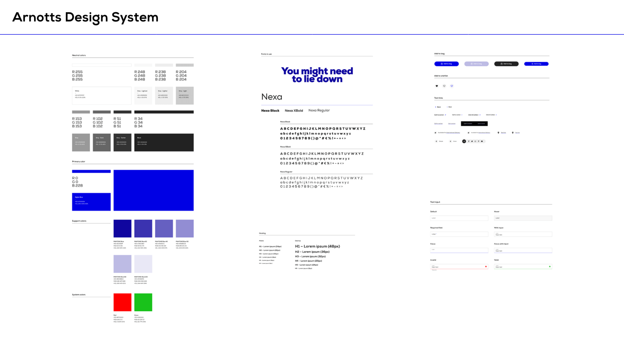
- Arnotts Visual Design System (Sept 2019)
- Atomic based visual design library
- New content types
- Component Prototypes
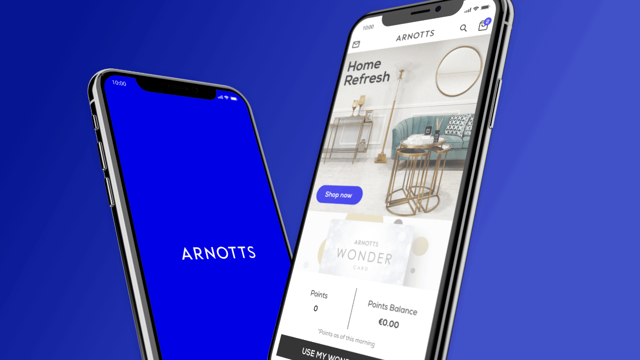
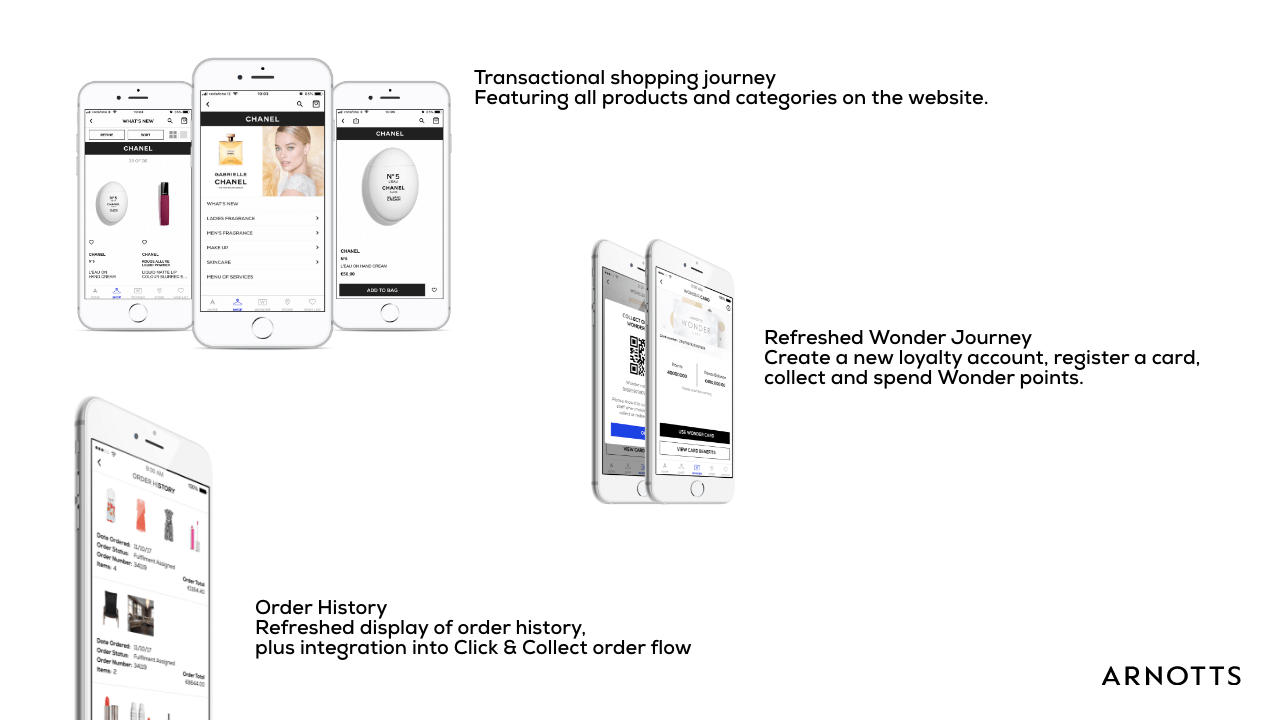
- Arnotts iOS/Android App (Oct 2019)
- Approve and create user stories for development
- Create style guide and approve design in collaboration with the App agency
- Arnotts ecommerce website rebrand (2020)
- Implement brand elements of the visual design system
- Enhance product discovery journey
My Role
I was the UX lead on the internal Arnotts team which had 2 Project Managers, a Business Analyst and a Technical Analyst. Externally we collaborated with our partner design agency, Onstate, to deliver on the digital brand & design system. While for the app, we worked closely with our existing development agency for the Brown Thomas app, NN4M.
Discovery
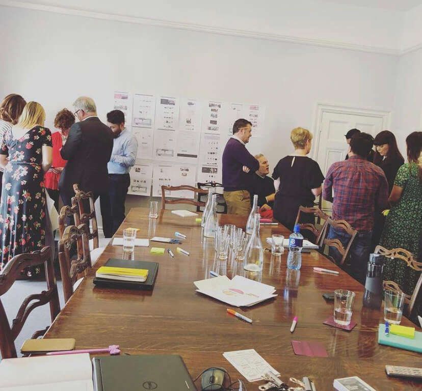
During the initial discovery phase, I contributed to the internal research effort using stakeholder surveys & discovery workshop sessions. The goal of these surveys & sessions was to better understand how and what changes might be needed to help them achieve their business goals. I wrote the survey and through this, in collaboration with Onstate, were able to gather key themes to focus on in the workshops, which we would hold over 2 days in early July 2019.
Design System
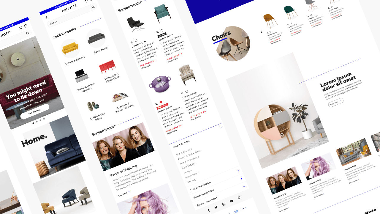
Having completed the Brown Thomas Design System earlier in the year, we knew the structure we wanted to follow. Working alongside the team at Onstate, we worked to develop & enhance the user flows and design patterns highlighted in research and known to the team.
During the course of the project I was responsible for sign off with the agency, ensuring standards and requirements were upheld while also providing wireframes to fill any gaps. I also presented to stakeholders at key project moments and led the final presentation to the executive team in Brown Thomas Arnotts.
iOS/Android App
I worked closely with our design agency partners to create a baseline visual style guide for the app development team to apply to the front-end layouts.
Once applied, I was responsible for signing off on the front-end designs ensuring they achieved the high standard the business desired. It was also my responsibility to collaborate & approve user stories ensuring all functionality and journeys were captured.
Ecommerce Website
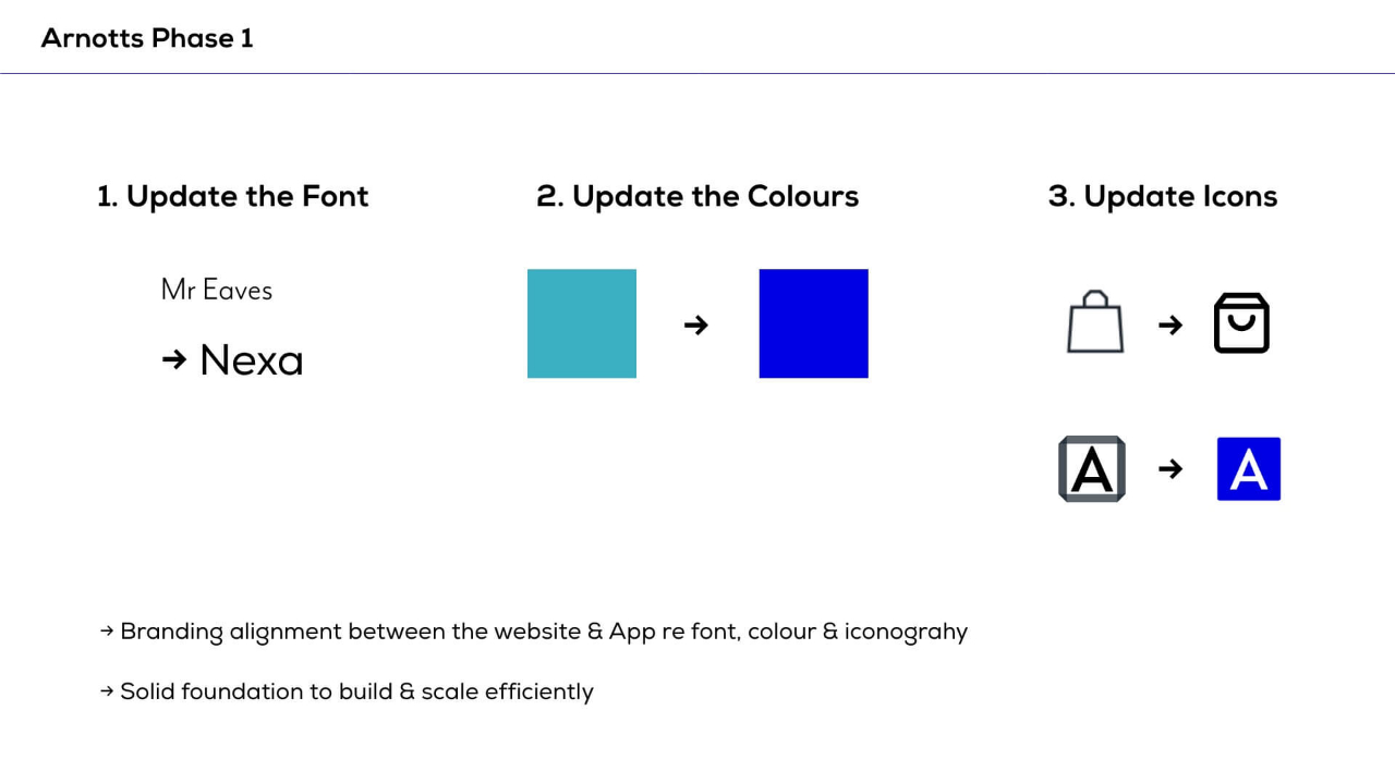
Once the visual design system had been approved by the executive team, we gathered together and began to plan the implementation with our Salesforce Commerce Cloud development team. Grouping tasks into sprints, the goal of sprint 1 was to bring brand alignment between the website and the app.
This involved introducing the new brand font, new brand colours and new iconography. Due to the large number of dependencies when updating the font, it was my responsibility to map the correct weights and sizes into tickets, working closely with our Business Analyst, QA and external Front-End Developer to ensure exact detail was available.
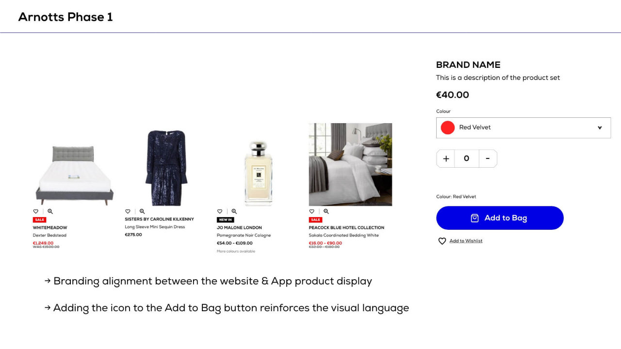
The second sprint focused on the customer journey through the shopping funnel - primarily filtering and UI enhancements on product listing pages. I created all high fidelity wireframes and collaborated with developers and QA to deliver on the sprint goals.
The Results
The primary result of this large scale project was a unified visual language across the website, app & in store communications. The design system introduced a shared set of principles allowing a consistent experience across the different touch points while also allowing us to scale and build new features quickly and efficiently.
The launch of the Arnotts App saw increased engagement with a higher conversion rate and AOV when compared to the website. The brand refresh and functional updates to the website, gave the user a more intuitive and streamlined product search and filtering functionality, along with some image & performance enhancements, all these changes contributed to an increase in conversion.
Visit the website → Download the iOS app → Download the Android app →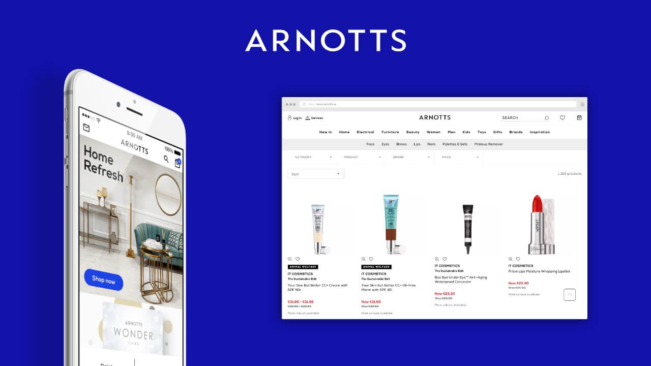
The Takeaways
This project gave me experience being involved in large scale organisational effort in bringing a consistent visual language to so many products and touch points.
It allowed me to work closely with numerous departments, stakeholders and agencies and gave me experience in balancing timelines & communications across the various streams. Learnings from previous projects were applied regarding stakeholder feedback loops - we decided to involve and communicate at key moments in the timeline rather than a constant loop which previously caused iterations and scope to become unwieldy.
It was a challenging 8 months and I certainly felt the weight of it all having been so involved in the process from initial discovery to product launches. The cadence of project and deliverables was not ideal and some pivots in the final design system were decided upon too late to retrospectively apply to the app that launched as the system was finalised.

