Background
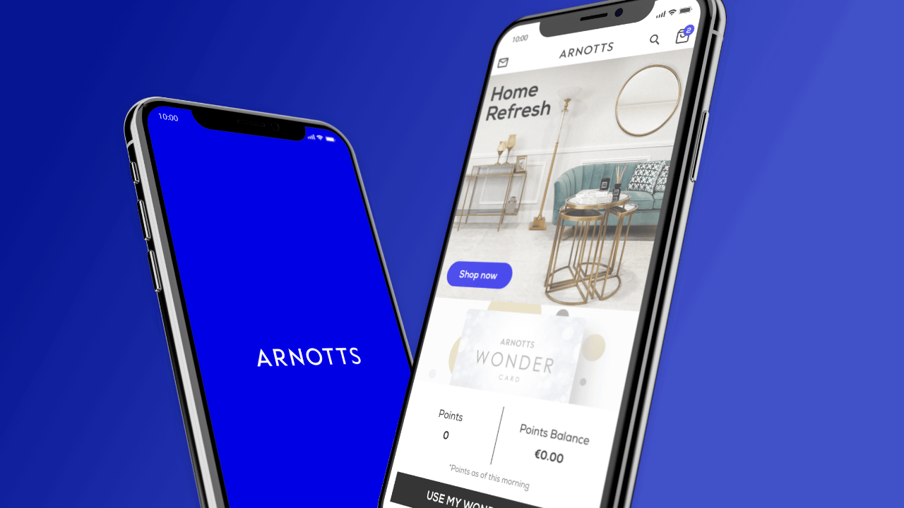
As part of the Arnotts Digital Rebrand initiative in 2019, it was decided that a design system would be created. The goal of the design system was to unify the visual language by bringing consistency and efficiencies as the brands digital footprint scales.
The Challenge
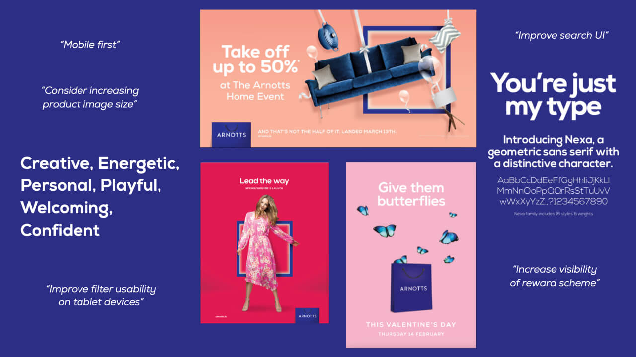
Having run a number of workshops and analysed customer research, we needed to create a system that captured key findings while also addressing the updated brand image. This allowed us to set boundaries on the scope which had previously been an issue within the Brown Thomas design system project.
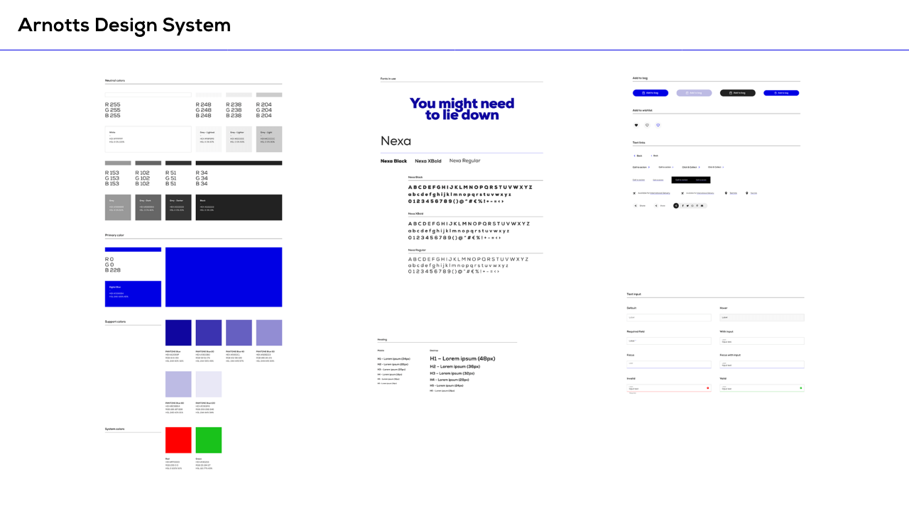
We partnered with the design agency, Onstate, who are based in Leeds, England. The timelines were tight and we also had to jump start core component design due to the Arnotts app project running in parallel.
My Role
I was the UX lead as part of the wider project for the digital rebrand and collaborated internally with a Project Manager & Business Analyst and externally with our design agency partner Onstate.
It was my role to oversee the creation of the system, providing wireframes and guidance on the Arnotts SFCC platform capabilities, ensuring the design system addressed the needs of the business and customer.
During key moments of the project timeline, I presented to an audience of stakeholders and business leaders on work in progress and communicated any key decisions that needed to be made and would require stakeholder input. I also lead the final presentation to the executive team in Brown Thomas Arnotts.
The Results
We delivered the final design system in September 2019, 4 weeks to spare and under budget. We were able to do this by using efficiencies gained from the structure of the Brown Thomas design system where we were able to quickly iterate to create a unique outcome for Arnotts.
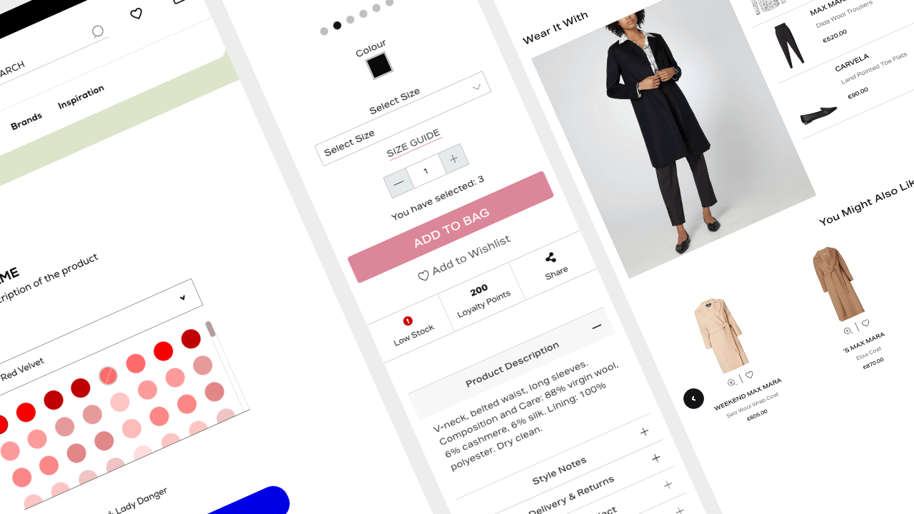
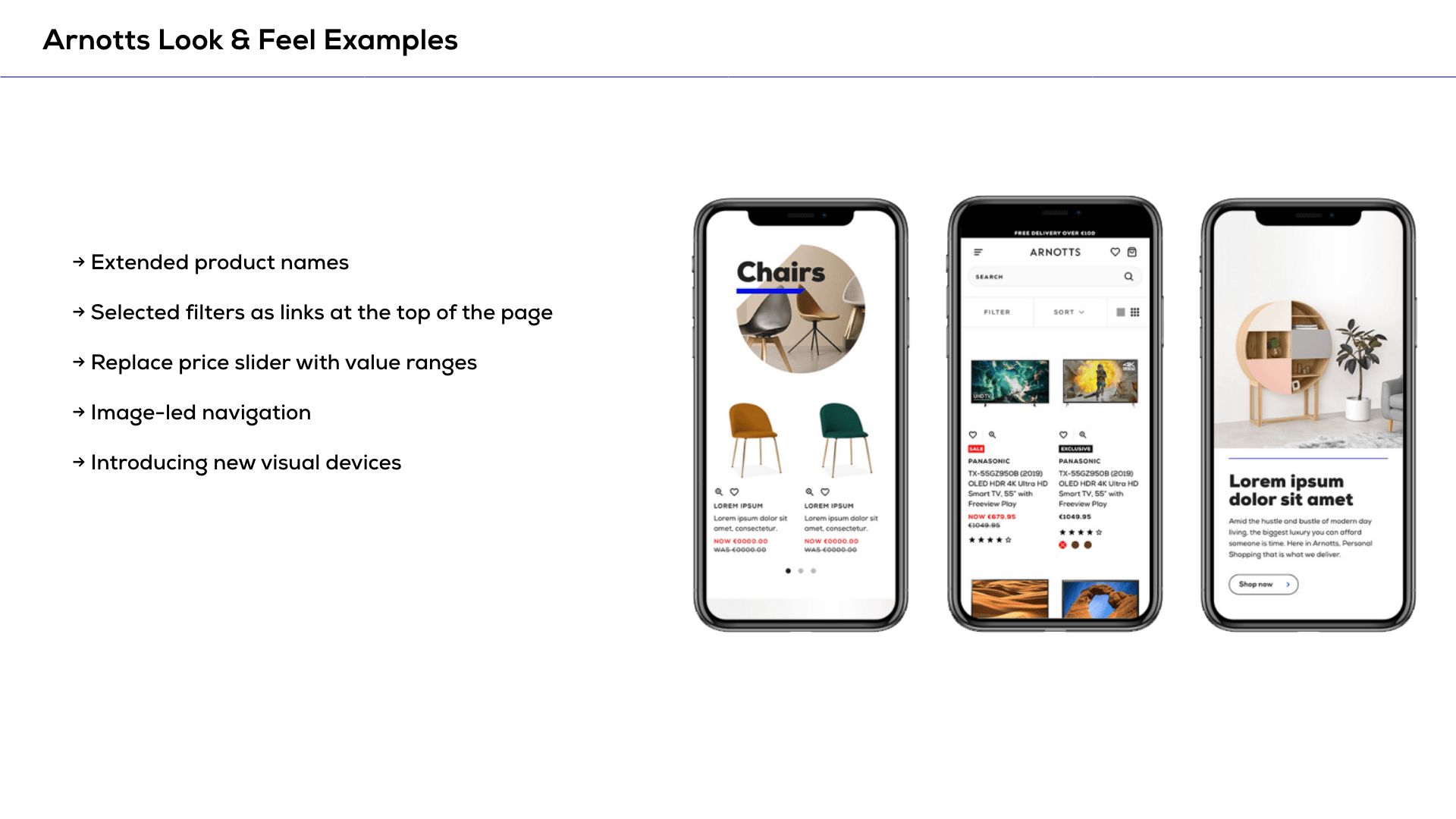
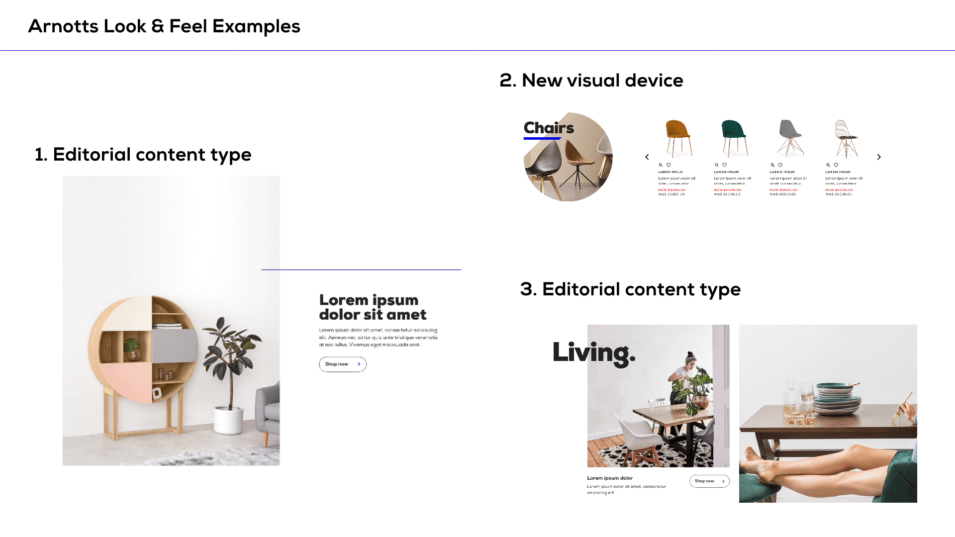
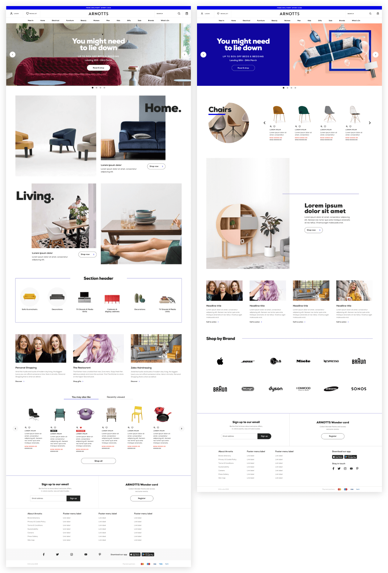
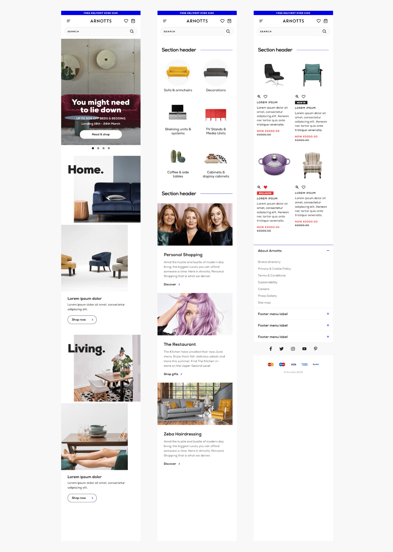
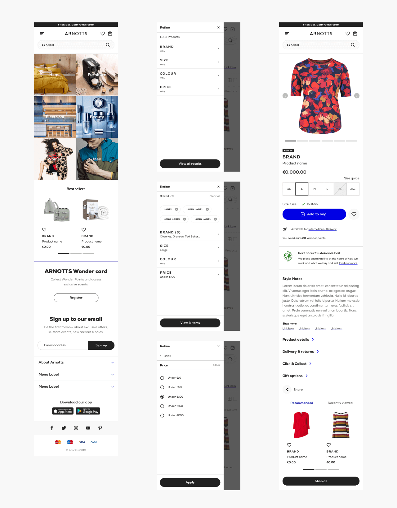
We were successful in creating a look & feel which elevated the brand and introduces some key creative and usability improvements such as:
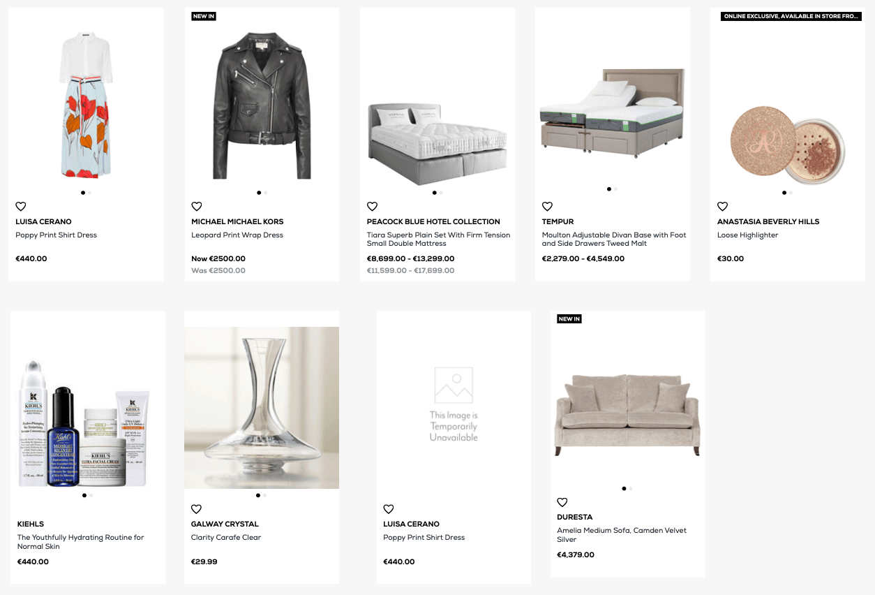
- Extended product names
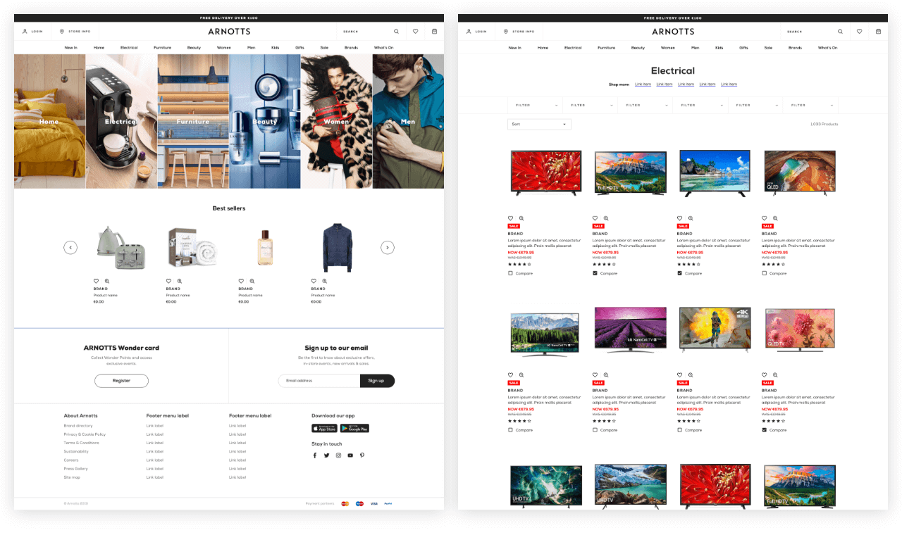
- Usability enhancements for product filters
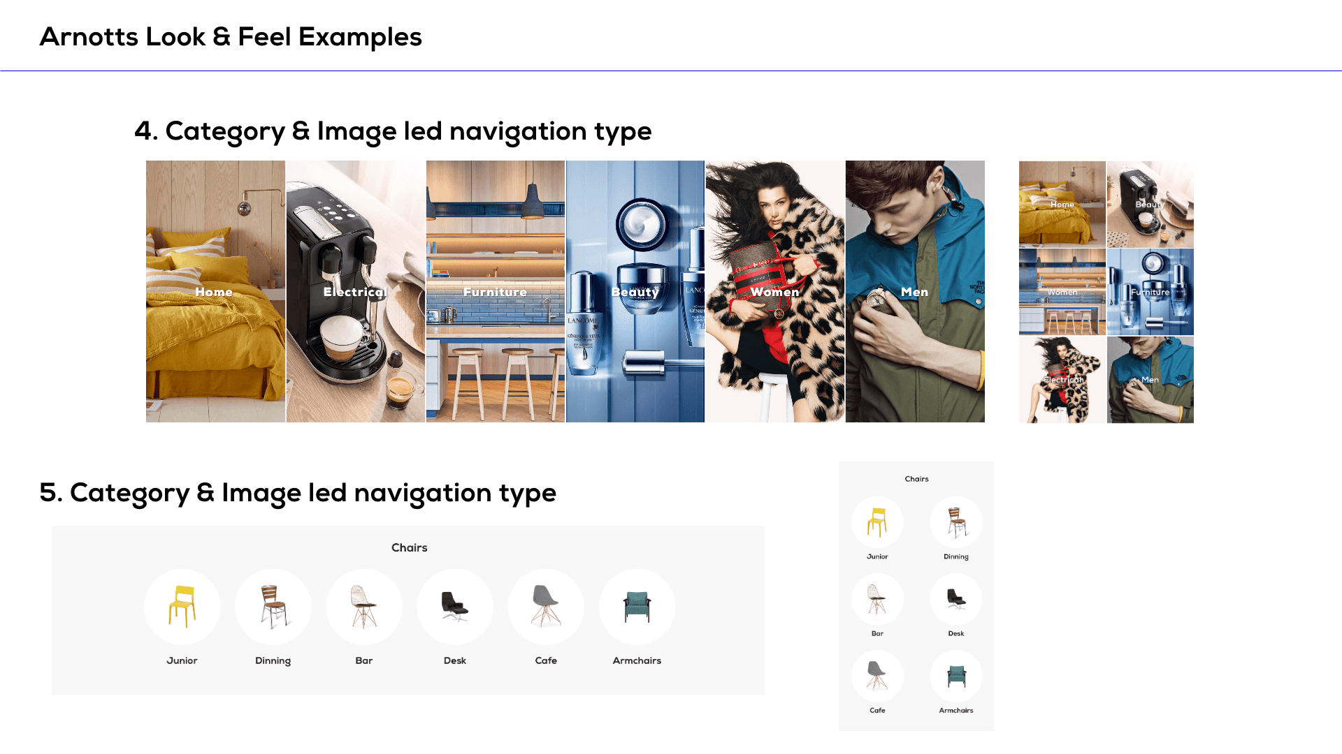
- Image led navigation
- New visual devices
- Editorial/lifestyle look & feel
Once the system was signed off, the internal team set about planning the development of the new system into the Salesforce Commerce Cloud platform. It was decided to plan to initial sprints:
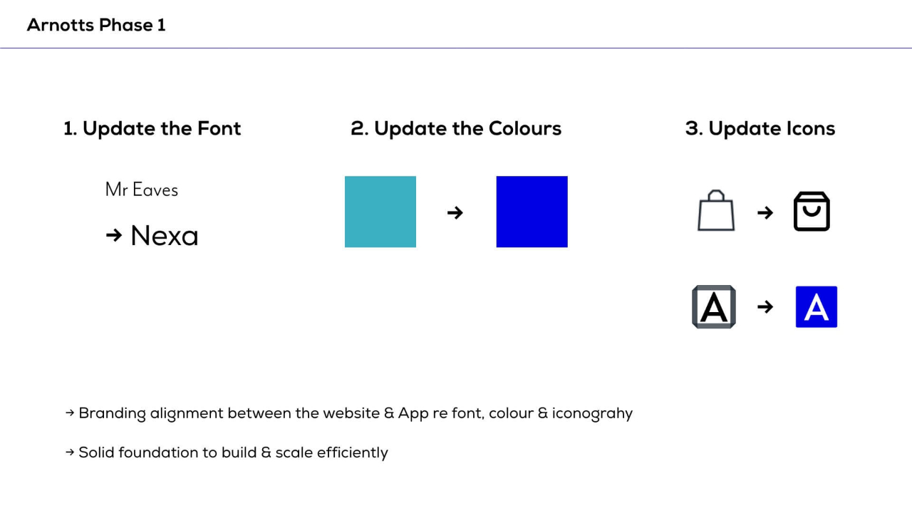
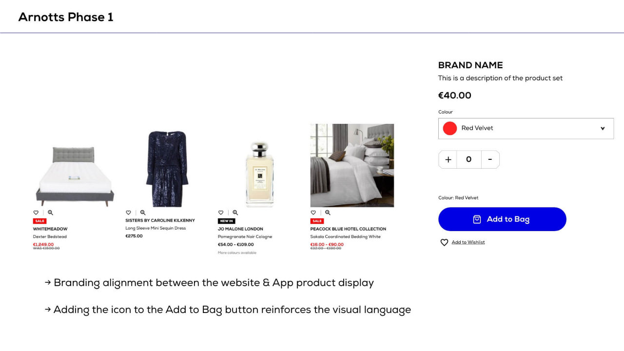
Sprint 1 - Brand alignment (font, icons, colours) (released Jan 2020)
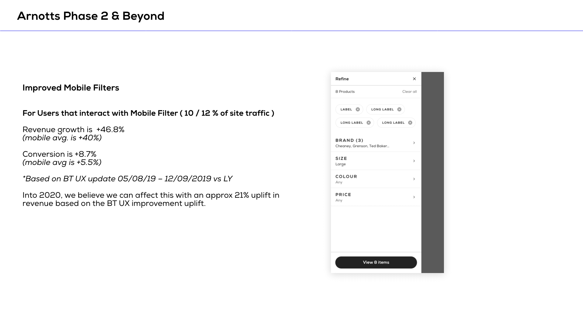
Sprint 2 - Filtering & Search enhancements (released Feb 2020)
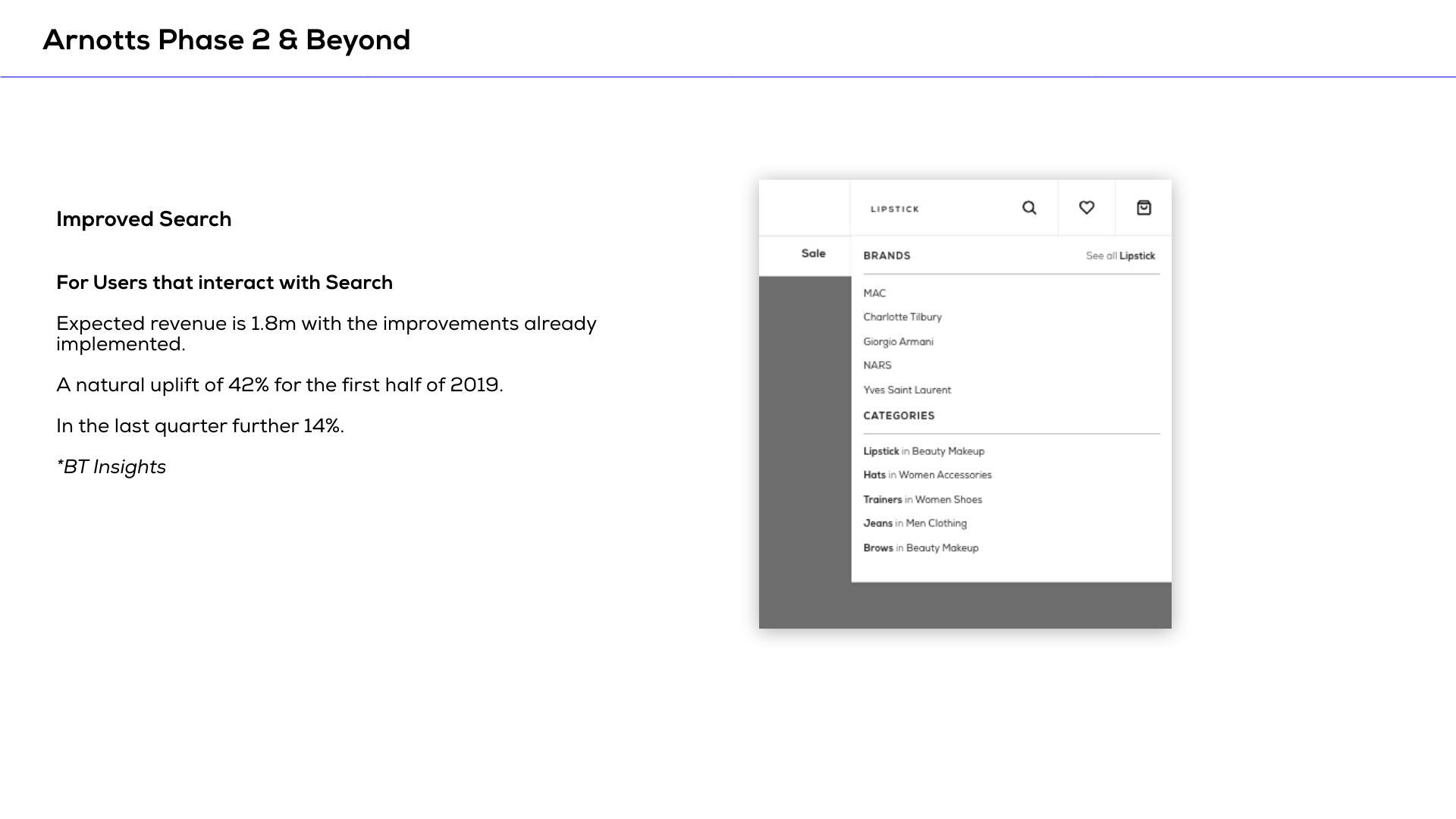
Due to the start of the pandemic, all further plans to further integrate the design system were shelved.
Visit the arnotts.ie → View the documentation →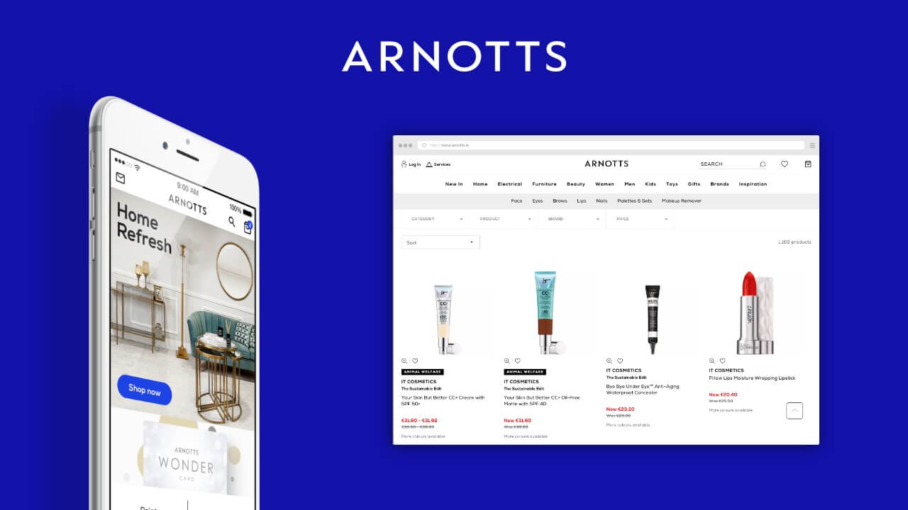
The Takeaways
In this project I was again able to develop my working relationship with stakeholders throughout the organisation and while also maintaining close relationships with our design & development partners.
It was also my second time involved in creating a design system and in the project I felt a lot more comfortable and in control of myself. The learnings and failings during previous projects allowed us to be very concise with our requirements and clear in our communications. We set clear boundaries regarding the scope which allowed us to focus on the key deliverables.
Unfortunately this was another project that did not see the full light of day though.

