Background
In 2017, we completed a UI refresh of the Brown Thomas checkout, integrating Material Design patterns across the journey. While achieving the intended goal of enhancing the usability of the checkout, there were still improvements to be made.
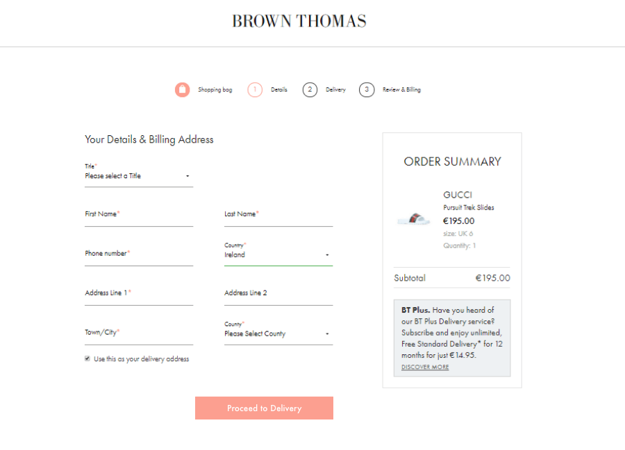
In 2018, and as part of the Brown Thomas Design System project remit, we began mapping out learnings and observations gathered over the previous 12 months. We wanted to enhance the checkout experience further, reducing unnecessary friction through the journey.
The Challenge
Our goal was to build upon some solid learnings from the initial UI refresh and to further enhance and simplify the journey where possible. Some areas of focus were to enhance the mobile & tablet checkout experience, enabling easier use of gift cards and loyalty points while also stepping away from using a Hosted Payment Page and to instead display the payment options within our own checkout ecosystem.
My Role
I was the UX lead on the Brown Thomas Design System and so it was my responsibility to translate the research, benchmarking and analysis into design. Internally we had intended for this to be the responsibility of our design agency partners Onstate, but on reflection felt this was best to stay in-house. I worked on this project with our internal Technical Analyst, Business Analyst, Project Manager and externally with a Business Analyst, Project Manager, Solutions Architect, Back & Front End Developers and QA from the development agency.
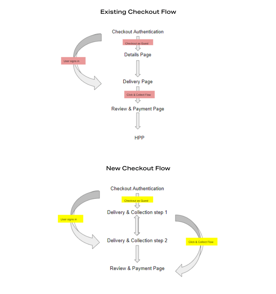
We initially held a discovery workshop with our development agency where we mapped out the journey of the various customer types through the checkout, evaluating where optimisations can be made and what is technically possible with SFCC. We came away from this session with a number of low fidelity wireframes for which I then set about creating an interactive prototype using HTML & CSS so that we could understand how this journey felt on a device. We carried out some basic usability testing with some volunteers from other departments in the business.
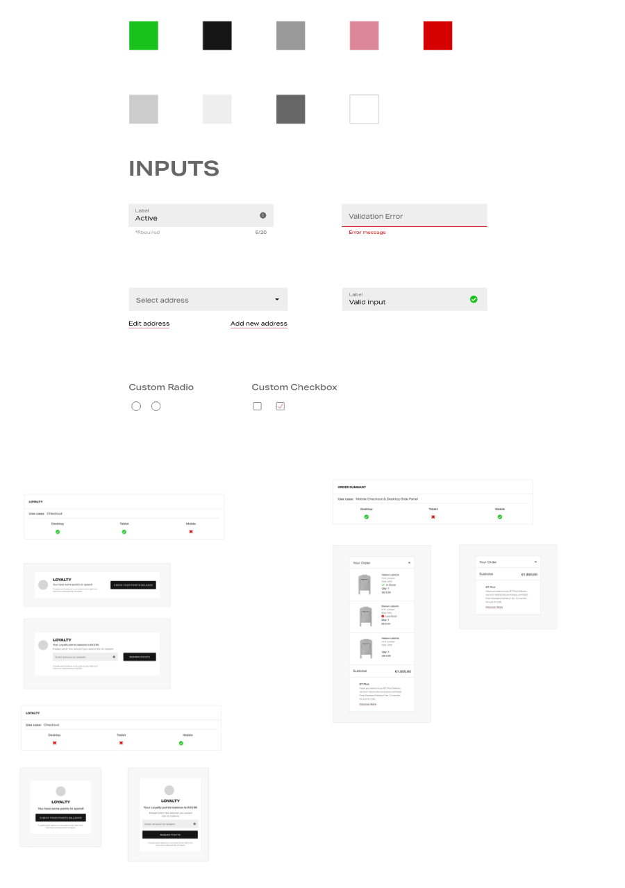
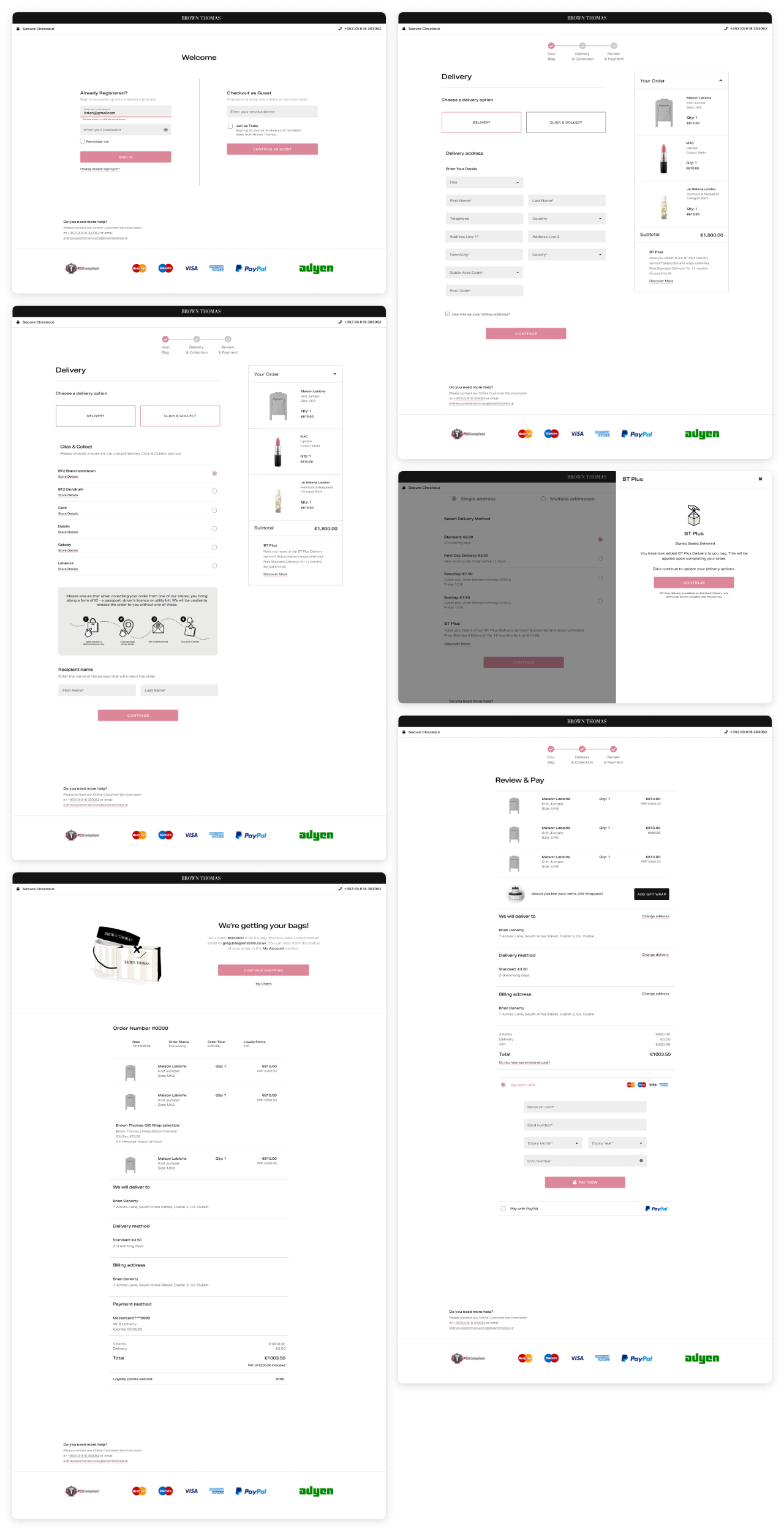
Once all amendments were captured, I created a style guide and set of device specific designs, ensuring a visual & functional consistency across the board. These were then evaluated by the development team and Business Analyst who then created an FSD (Functional Specification Document) for which I was one of the key sign off stakeholders. Once development began, I assisted the internal QA team in any way needed, ensuring high standards of the business were met.
The Results
The checkout redesign was released to production in May 2019 and saw an immediate uplift in conversion, particularly on mobile devices which was a goal of the project.
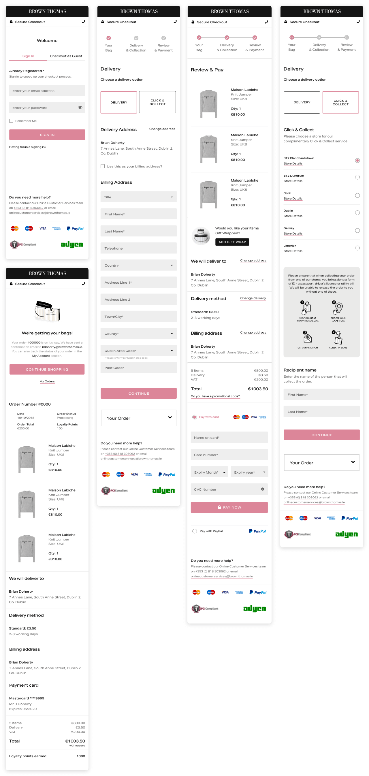
In June 2019, as part of a CRO initiative, a one question post purchase poll was set to be displayed to customers that successfully purchased. The aim was to gather any qualitative feedback from customers to align with our quantitative metrics. Working alongside my internal UX colleague, we were able to use this data to identify some key failings of the design and functionality.
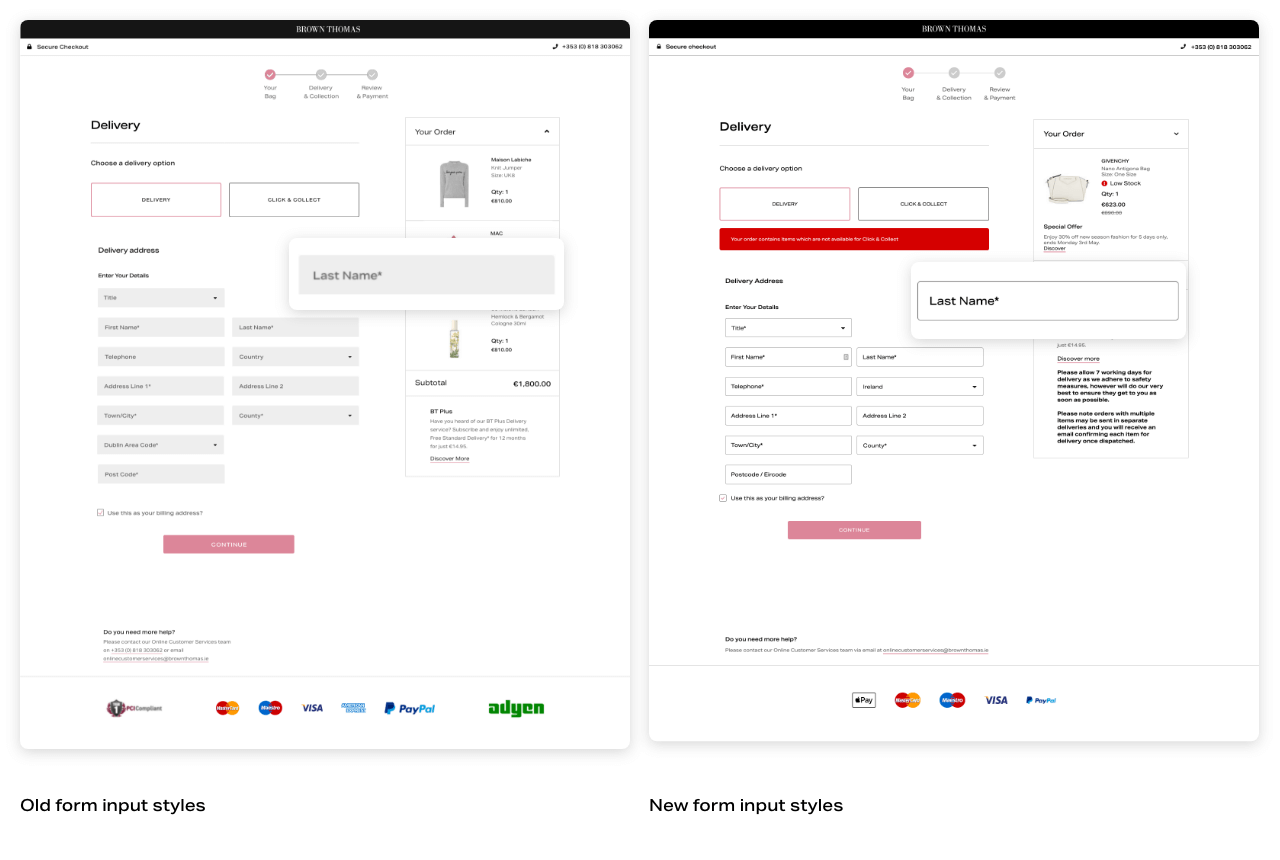
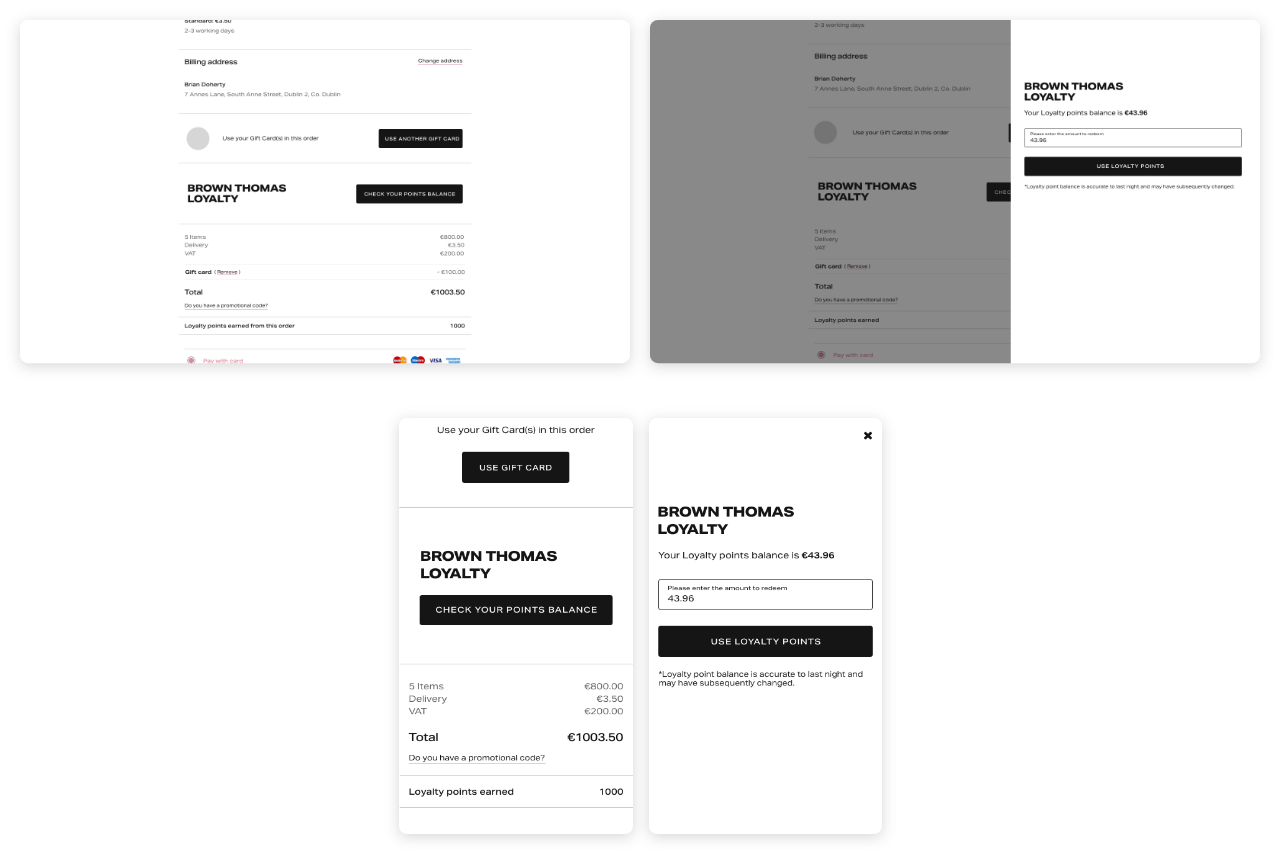
The “express checkout” button was disabled due to SFCC address mapping issues which were blocking customers from checking out. My colleague also set about refining the form validation further and abandoning the use of a buttons disabled state. I discovered that the form input design was leading to issues of accessibility and affordance, with the solid light gray being replaced with a white background with an outline to clearly signify an input. The gift card and loyalty redemption components were also reverted to modals after being initially launched as inline dynamic panels. All of these alterations were released throughout the course of 2020.
The Takeaways
This was a project that I was involved in from the beginning, seeing it through from discovery to the initial launch and then through analyses and ideations over the subsequent years. It allowed me to fully own the design process while working closely with developers and also expanding my knowledge of product & project management techniques.
Some of the later identified issues were surprising but allowed me to learn and expand my knowledge of how customers perceived and expected the checkout to function.
